BCLC Registration Kiosk
Digitizing Casino Registration
British Columbia Lottery Corporation (BCLC) is a crown corporation that oversees all legal gambling in British Columbia, and manages lottery and gambling-related digital products.
During my time at BCLC, I was tasked with digitizing their loyalty program paper registration through on-site kiosks.
As the lead product designer, I collaborated with a product manager and three engineers over a month to streamline the registration process.
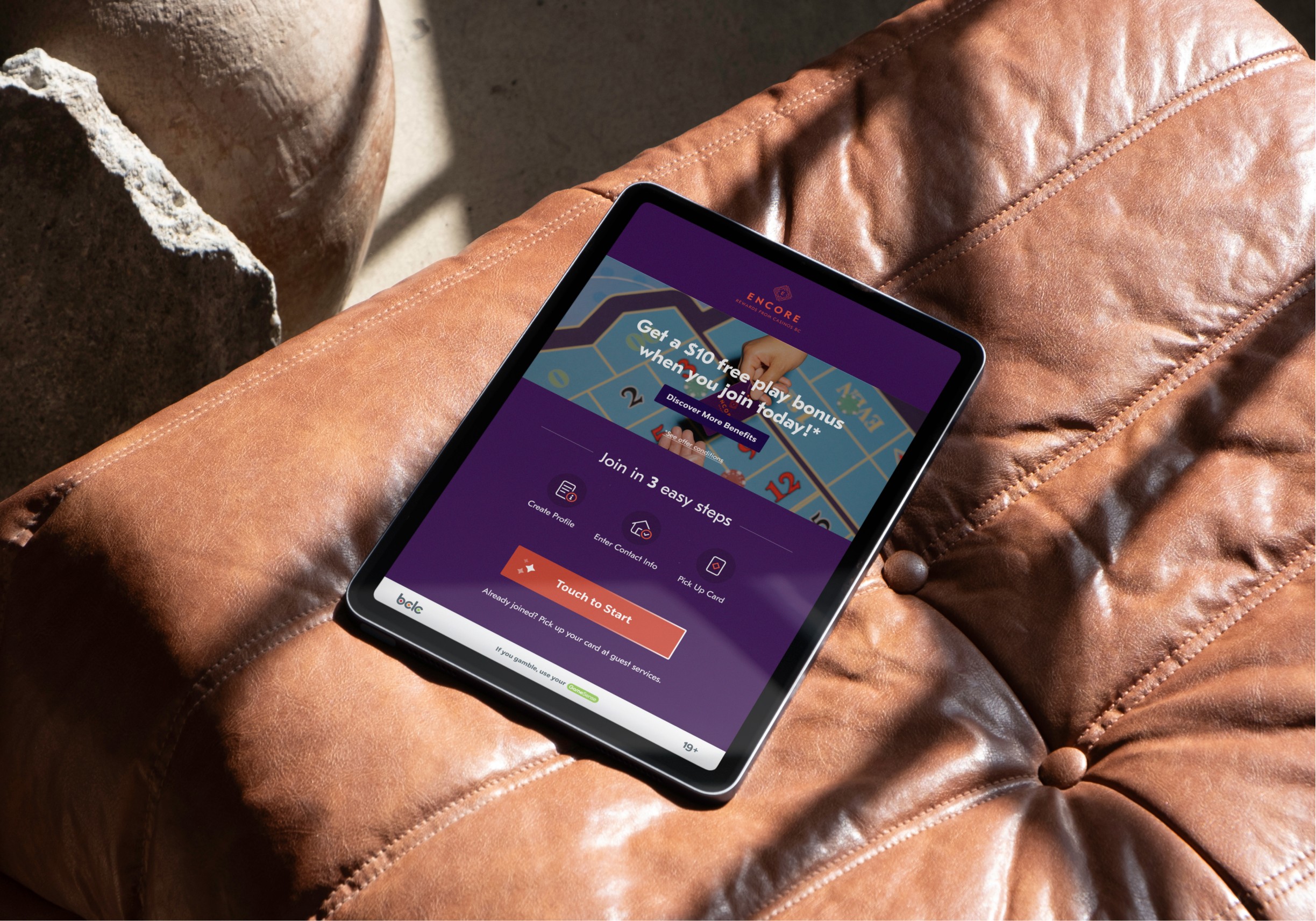
A sneak peek into the final solution
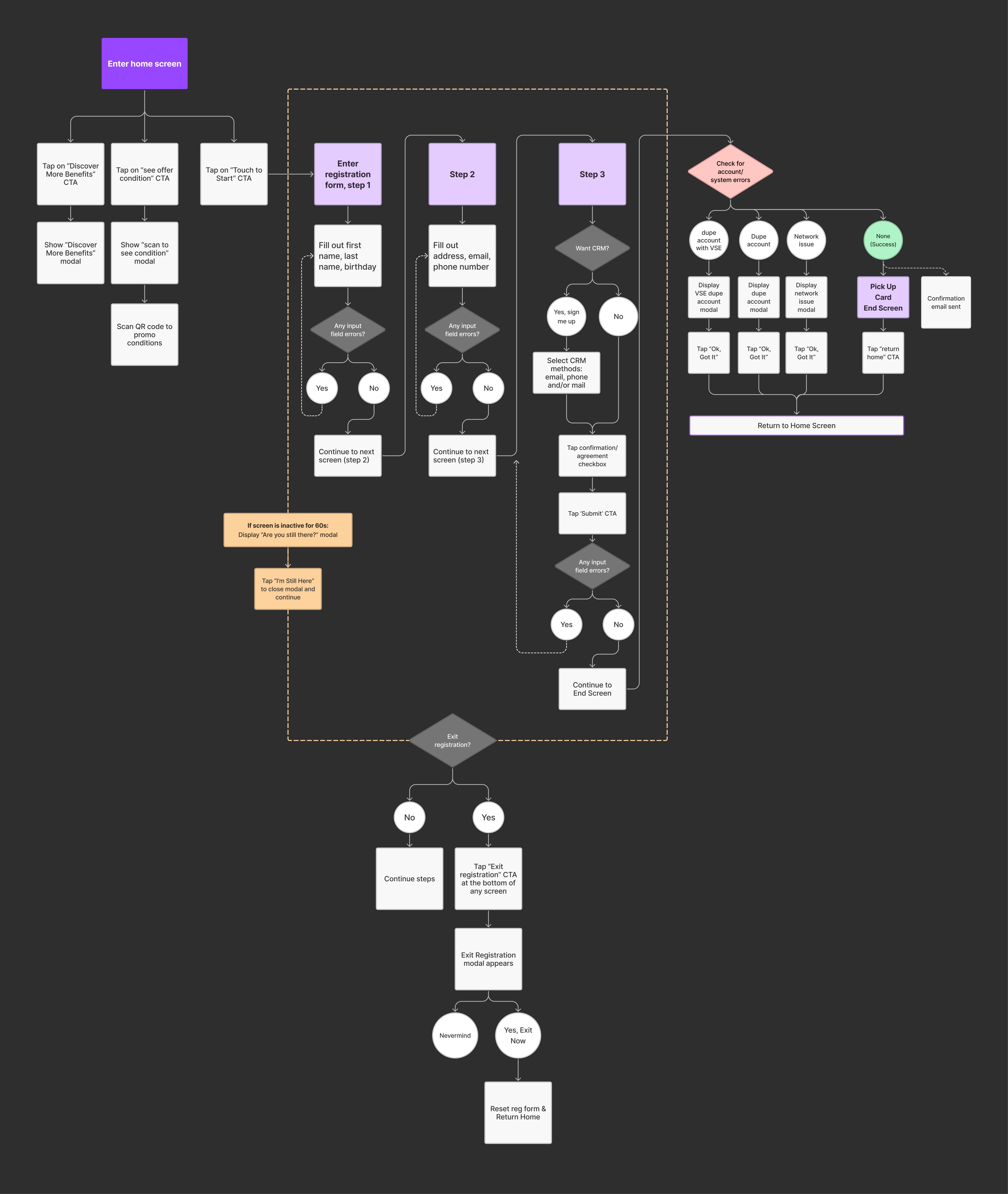
User flow
Addressing Paper-Based Inefficiencies
The casinos used paper form for the loyalty program registration. It presented 2 main
issues:
For casino players
The process was inconvenient and potentially time-consuming.
For the business
Manual input by staff often led to data inaccuracies and loss.

The kiosk solution launched at the end of last year in four casinos. It has been well-received:

Cut registration time by 1-2 minutes, reducing process duration by 50%.

Significant increase in data quality, particularly for players' legal names.
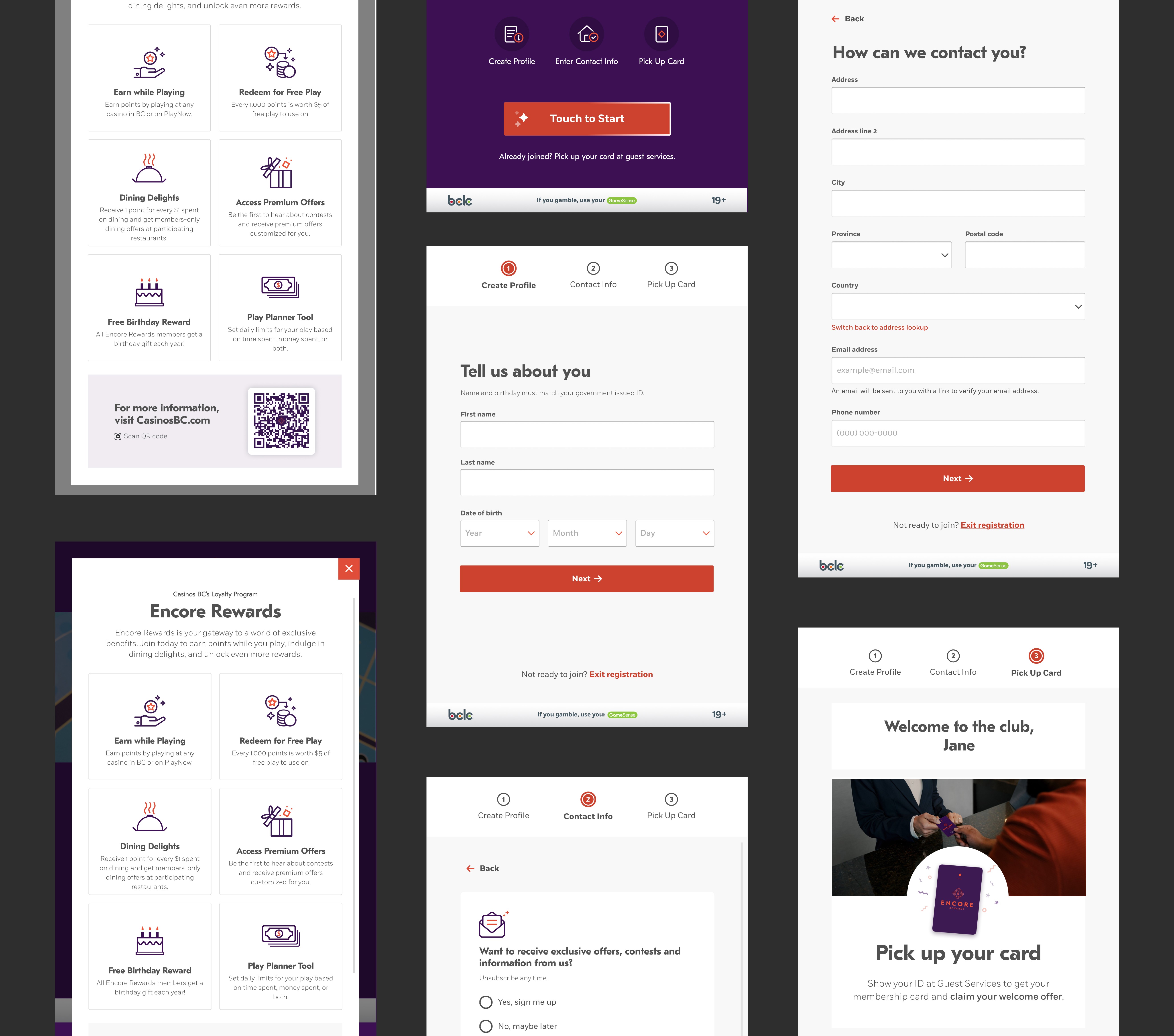
Final Design of Kiosk
To streamline the royalty program registration process, I designed a on-site registration kiosk for casino players.
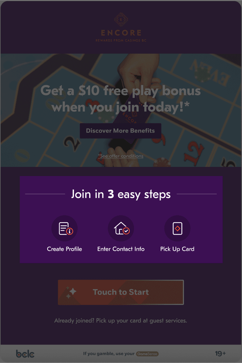
Regular sign up flow prototype
2 Design Challenges
Challenge 1: Ensuring Card Collection
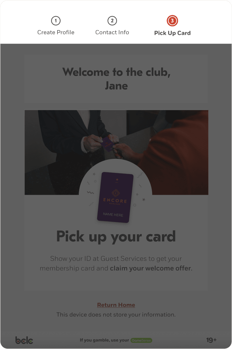
The kiosk doesn't dispense cards, so I needed to remind players to collect them after registration. The solution included 3 approaches:
Clear instructions on the home screen reminds players to pick up the card.
A progress bar at the top not only guides customers through the steps but also reminds them about picking up their card.
A fun confetti animation draws attention to the card pickup reminder.
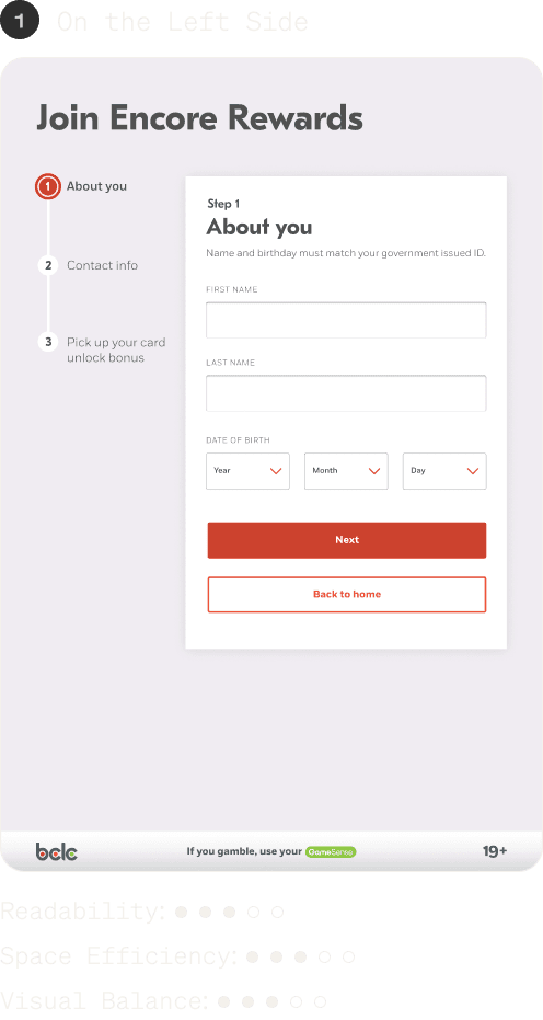
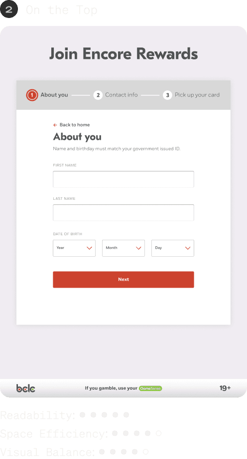
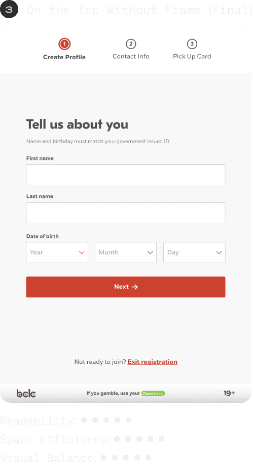
Challenge 2: Optimizing Progress Bar Placement
To determine the most suitable location for the progress bar, I explored 3 different placements. The decision was based on ratings from three perspectives: readability, space efficiency, and visual balance. As the result, I chose the 3rd one.
Lessons Learned and Project Insights
This project provided valuable lessons in:
Stakeholder feedback: Uncovering root issues and making informed decisions
Developer collaboration: Creating comprehensive hand-off documentation
Design constraints: Balancing system limitations with creative solutions
Through this project, I honed my ability to create user-centered designs that address both user needs and business goals, while navigating stakeholder management and technical implementation complexities.
